Custom Reporting: Empowering Data Insights Creation and Management at Scale for Large Enterprise Users
Holder

This is one of the two projects I worked on as a Product Design Intern at Rubrik, a cybersecurity company serving 5,500+ leading organizations.
My Role
UX Designer (collaborating with 1 Product Manager, 2 Software Engineers, 2 UX Researchers, 1 UX Writer and the Visual Design Team)
Timeline
5 weeks during 2023 summer internship
Tools
Figma, FigJam
Results
1. Conducted competitive analysis for reporting features, synthesized research findings: laid foundations for future report enhancement.
2. Worked with UX Researchers in 11 user feedback and 6 concept testing calls with small/large enterprise users to upgrade custom reporting experience: feature engagement rate increased by 5%.
Problem
Business challenge: low feature engagement rate
Rubrik Security Cloud (RSC) is the key product of Rubrik. RSC reporting provides customizable and automated data management insights, enhancing security compliance and strategic decision-making. Despite Rubrik offering comprehensive reporting capabilities, many customers, particularly those from large teams, are not fully utilizing these features. Instead, they opt for alternative tools for their report generation and management needs.
User pain points: spending a long time customizing the data report back and forth
Our target users are primarily backup admins, database analysts, and IT managers. We worked with two UX researchers in 11 in-depth interviews to identify 21 user friction points. Given our team's ownership, we decided to address three main problems:
Users repeatedly create and test new reports as they are unsure which template best fits their data requirements.

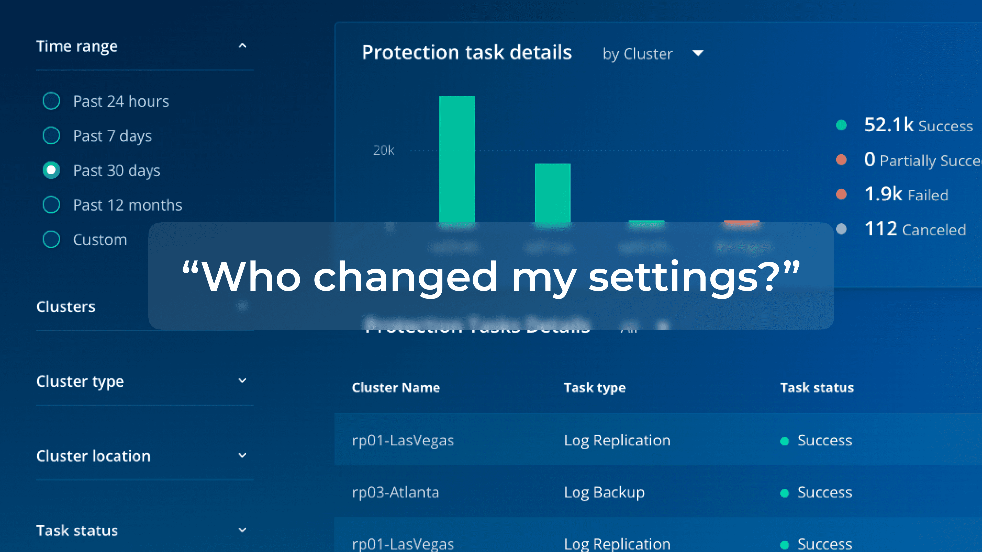
Unexpected modifications of the report contents occur frequently in a large team due to unclear report ownership.
Users struggle to locate scheduled reports and to adjust the schedule.

Goals
How might we…
Business Goal: Improve the engagement rate and customer satisfaction.
User Goal: Create, edit, deliver, and manage reports efficiently.
Design Goal: Resolve the friction points in the user journey, finding a balance between efficiency and user autonomy.
Under a pile-up of constraints?
A deadline spanning 5 weeks for the design team
Little existing insights on users' mental models of the report features
Limited bandwidth of the engineering team
Solution
Explore, find the best-fit, and create
Pain Point: Users repeatedly create and test new reports as they are unsure which template best fits their data requirements.
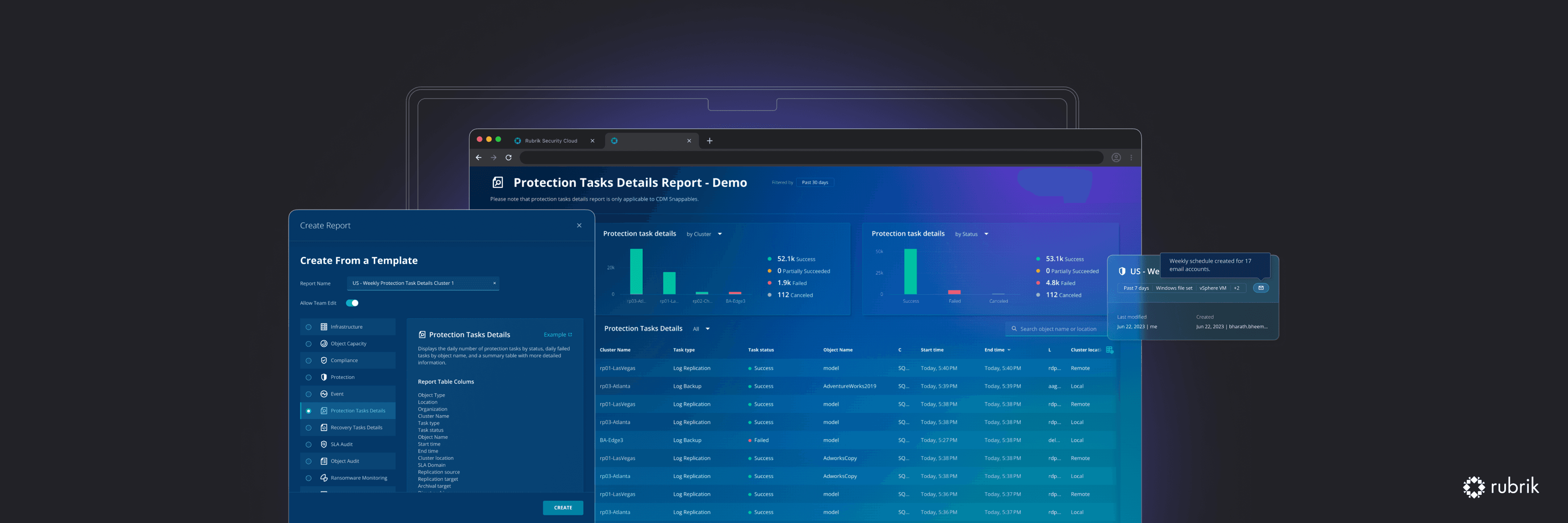
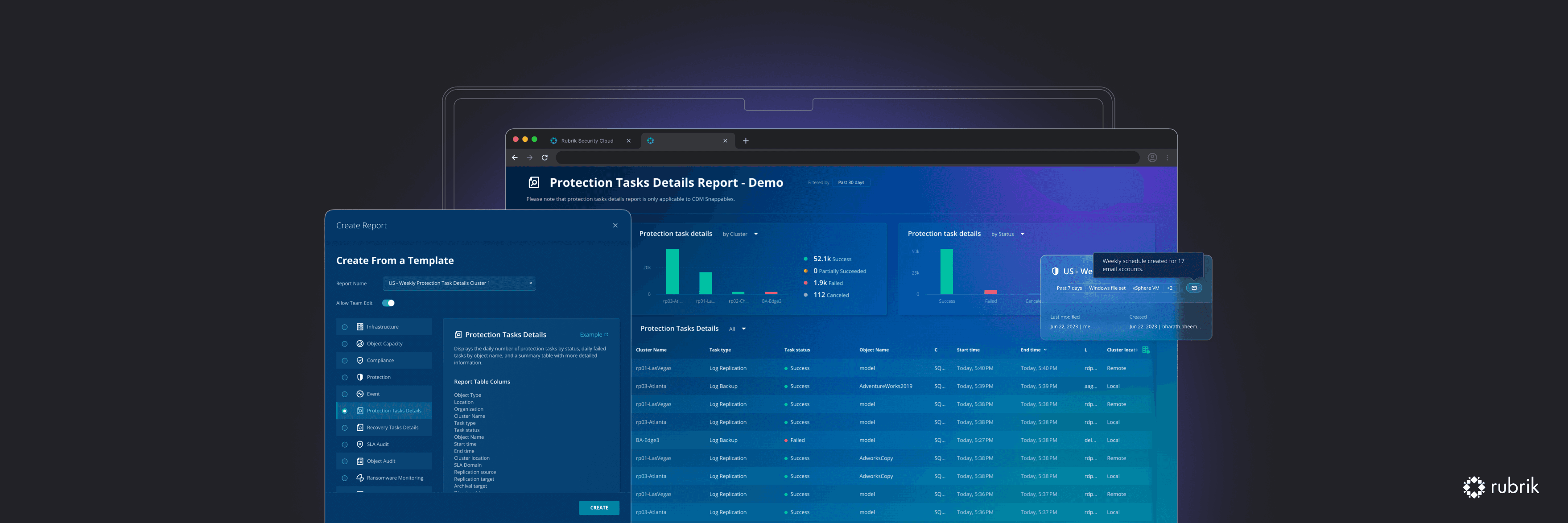
Quick report creation modal: Users browse through data types and examples in different templates, to find and customize the best-fit.
Know and control who can edit your report
Pain Point: Unexpected modifications of the report contents occur frequently in a large team due to unclear report ownership.
Improved information architecture + access control: Users easily find reports created by them and control team edit access.
Manage report schedules with one click
Pain Point: Users struggle to locate scheduled reports and to adjust the schedule.
The new preview cards: Users easily get key information from the preview cards, and quickly find or edit the report schedules.
Results
Feature engagement up 5%, user satisfaction score improved by 22%
The new custom reporting upgrades streamline the process of creating, editing, delivering, and managing various reports, motivating users to switch their reporting from other tools to RSC. It aids in achieving one-stop data management and enhances user satisfaction.
What journey led us to the design solutions?

Challenge 1
This thing called reporting, where do we start to improve first?
Without a pre-existing database or insights into how our customers use reports in their daily tasks, it's a bit of a mystery. What are the mental models our users have about reports? As Rubrik offering more than 12 ready-to-use reports and diverse features for various use cases, the big question is: where do we begin to enhance our offerings? We're eager to tackle this challenge, focusing keenly from our users' perspective.
Explore
Competitive analysis: 6 products, 4 dimensions, 20 features - but we still have the question
I embarked on a journey to understand the landscape of what our competitors were doing. Diving deep, I spent a day conducting 6 competitive analyses, focusing on reporting features across 4 critical dimensions: visual presentation, customization and flexibility, shareability, and the availability of documentation and resources. This deep dive was revealing – it showed a lot of opportunities for us to improve. But do these features help our users achieve their goals?

11 In-depth user interviews - now we understand the user journey
I worked with two UXRs in the user research, and we categorized the personas into two types: routine users and need-based users. Routine users access reports regularly, either on a daily or weekly basis. Need-based users only access report when looking for specific data with lower usage frequency. We summarized their pain points during the 5 stages throughout their journey.

So many things we can improve! But if only 4 weeks left…?
Given the time and engineer resource constraints, how can we extract the minimized solutions that make the most magic?
Click to see each step
Step 1:
Map out design directions
Step 2:
Prioritize based on pain points
Step 3:
Get the quick fixes in

Now we're set to pursue the 3 directions we've narrowed down!
The three steps listed above helped us decide to prioritize addressing these three key pain points remaining in the current phase:
Users repeatedly create and test new reports as they are unsure which template best fits their data requirements.
Unexpected modifications of the report contents occur frequently in a large team due to unclear report ownership.
Users struggle to locate scheduled reports and to adjust the schedule.
Prototype / Challenge 2
🧐 How might we help users efficiently create reports from the most suitable template, while still offering enough choices in initial customization?
We offer 12+ report templates of various categories, including infrastructure, compliance, protection, threat monitoring, and more. To save time, users create a new report starting with a template, and proceed to customize the contents. Currently, they have to try each template, one by one, to test and determine which one best fits their data needs. I proposed 3 concepts for report creation, and crafted prototypes for each of them to highlight their value.

Idea 1: Dropdown Button with Report Description
Users have the option to see a summary of each report template, and click to generate a new report.
Efficiency: ★★★★☆
Autonomy: ★★★☆☆

Idea 2: Report Creation Wizard
Users follow a four-step process: choosing a template, modifying filters (optional), scheduling email delivery (optional), and confirming the basic report setup.
Efficiency: ★★★★★
Autonomy: ★★★☆☆

Idea 3: Template Selection Modal
Users select a template based on description and the data types it supports. They also set up the report name and team edit permissions to finish creating the report.
Efficiency: ★★★★☆
Autonomy: ★★★★☆
Validate & Iterate
Asking help from users in concept testing
Together with UX Researchers, we carried out 6 concept validations to collect feedback from backup admins, database analysts, and IT managers in both large and small teams. When testing the prototypes, users reported feeling more efficient and confident with their routine tasks and expressed overall satisfaction with the upgraded reporting features. Additionally, during the think-aloud tasks, some users voiced their concerns, providing insights that aided us in refining the designs.

Idea 1: Dropdown Button with Report Description
Pros: If the user already knows about RSC report templates or has a particular template in mind, this approach will be efficient.
Cons: Users find it difficult to identify the type of report solely from descriptions. For them, the data types and available filter options are more important info.
Idea 2: Report Creation Wizard
Pros: Users are well-informed about the data contained in each template and can modify the primary filter groups using the wizard, streamlining future edits.
Cons: Some users are hesitant to set up email delivery before reviewing the full report and prefer to observe how the results vary in response to different filters.
Idea 3: Template Selection Modal
Pros: This solution helps users quickly find what they need, and only requests information that the users are confident to fill in at this stage.
Cons: Some users find the table column could be overwhelming and suggest improved data structure to highlight the key data types.
Result: Iterating based on Idea 3 to build the report creation modal
Informed by user feedback, we chose Idea 3 (the template selection modal) as the best way to assist users in quickly choosing the most appropriate template. Once users select a template, they will be promptly taken to their newly created report and presented with advanced customization options.
Although users appreciate the “examples” we provided as external links in the report creation modal, they expect to see report visualizations instead of helpful documentations when viewing those examples.
Creating local components based on the global design system
After iterating the design, I developed local components to facilitate efficient collaboration with other UX designers in the team on future related projects.

Takeaways
Shifting between different domain contexts to design core features
The technical context, industry terms and the complicated use cases were challenging, but I learned to have fun embracing all the unfamiliarity and inject my design experience and knowledge into the workflow.
Getting help from others more efficiently
In our bi-weekly design critiques, I learned to share my designs and get the feedback I need in a more efficient way. I found that designers who provide enough contexts to the team and clarify what feedback they need, can always get the most out of design critiques. I also became more comfortable giving feedback to other designers and support them with my insights.